
There are two places to customise a Notion widget. Notion controls the block's size and position. The widget provider controls what happens inside the frame, including its colours, type and settings.
That distinction saves a lot of poking at the wrong menu.
Start with the page, not the colour picker
Decide where the widget will sit before you style it. A wide calendar needs different proportions from a small date card in a side column. Resize the embed until the content feels comfortable, then match it to the page around it.
In Notion, you can change the page font to Default, Serif or Mono. You can turn on Full width, reduce the text size and colour individual blocks. These settings do not reach inside an embedded widget. They give you the surroundings the widget needs to match.
Choose one background colour
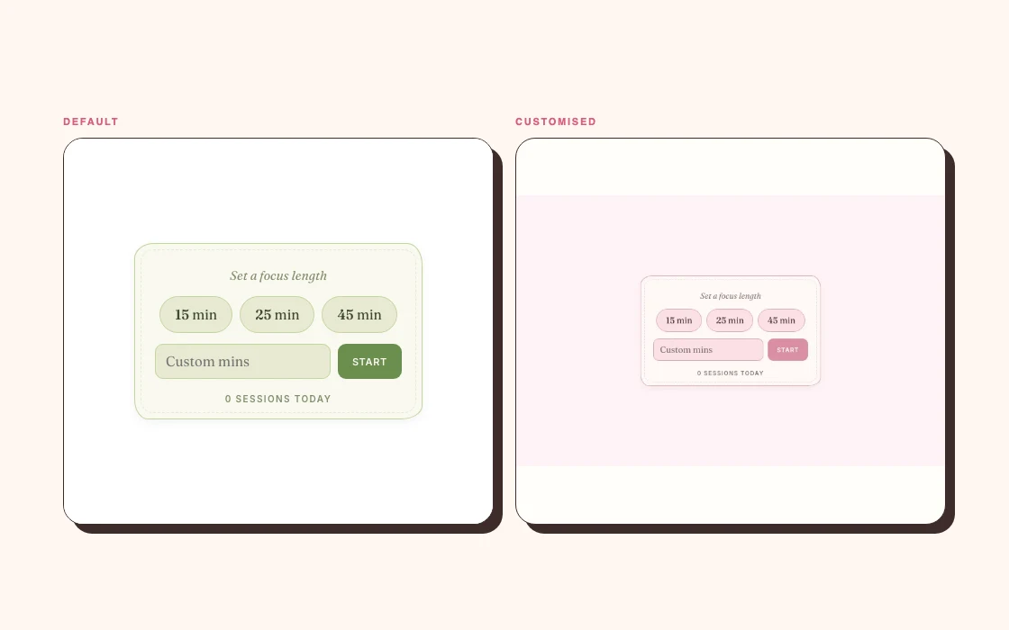
The easiest way to make several embeds feel related is to give them the same background.
If your Notion page uses a white background, choose white or a near-white widget background. For dark mode, use a dark widget theme rather than placing a bright white rectangle in the middle of the page. A transparent option can work well, but only when the text and controls remain clear in both light and dark settings.
Do not rely on transparency without testing it. A pale pink label that looks lovely on white may vanish when Notion switches to dark mode.
Use one main colour and one accent
You rarely need a separate palette for every widget. Pick one main colour for backgrounds or large shapes and one accent for progress, selected dates or buttons.
For example, a pale cream background with a muted berry accent can carry a countdown, habit tracker and calendar without making them identical. The repeating colours do the joining. The widgets can keep different shapes and purposes.
If you have a favourite cover image, sample one quiet colour from it instead of trying to reproduce every shade. Notion pages already contain icons, covers, database tags and text highlights. The widgets do not need to carry the whole theme alone.
Match the mood of the type, not every letter
Notion gives you three page fonts. Widget providers may offer many more. Exact matches are often impossible, and chasing one can make the page feel fussier.
Match the general character instead:
- pair Notion Serif with a soft or bookish widget typeface;
- pair Default with a plain sans serif;
- pair Mono with a restrained monospaced or pixel style.
Keep small labels easy to read. Decorative type works better on one large number or heading than on every control.
Make widgets the same visual height
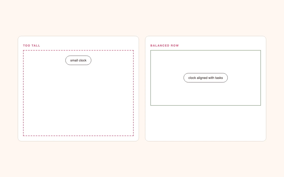
Two widgets in a row look calmer when their outer frames line up. The content inside can differ, but the top and bottom edges should feel intentional.
Place the blocks in columns, drag their lower edges to a similar height and leave a little breathing room around the content. If one widget needs twice as much height, give it a row of its own. Stretching a small clock to match a monthly calendar only creates empty space.
On mobile, Notion stacks columns vertically. Check that each widget still makes sense when it loses its neighbour. A label such as “today” may need to live inside the widget rather than relying on a heading in the column beside it.
Use animation sparingly
An animated clock, falling confetti and a pulsing timer can each be delightful. Put them together and the dashboard never settles.
I would keep one moving element in the part of the page you see first. Static date cards, progress bars and checklists can support it. If a widget moves only when you interact with it, it is less likely to become visual background noise.
How customisation works on Dearly Peculiar
Every Dearly Peculiar widget has a customisation page with a live preview. You can start free with a Dearly Peculiar account. A single-widget licence covers that widget; a pack covers its included widgets. Subscription and Lifetime cover the whole collection.
Change one thing at a time while watching the preview. Start with the background, then the accent and type. Sign in, add the widget to your account and choose whether to use your free customisation on it. Save your settings, then copy the embed link. Keep the full generated URL because it may contain the settings the widget needs.
Soft Clock and Focus Timer also have a Float on top setting, which pops the widget into a small window above your other windows. The Float on top guide shows how to switch it on.
If you use several widgets, open them beside your Notion page rather than customising each in isolation. A dusty rose can look neutral on its own and much louder beside a warm beige cover.
A five-minute matching method
Set the Notion page font and width. Choose the widget's background to match the page. Pick one accent from the cover or page icon. Resize the embed, then check desktop and mobile.
If the mismatch only appears on a darker page, use the dark mode guide. If the whole page needs a visual reset, refresh the page you already use. For a group of widgets that feels mismatched, see how to make widgets belong together.
Stop there for a day.
If the widget still feels out of place when you return, change one obvious mismatch. Usually it is the background, the frame height or a colour with too much contrast. Reworking the entire palette tends to hide the simple fix.


