
You do not need a new template to make Notion aesthetic. Give the page one clear purpose, choose a font and width that suit its content, then repeat a small set of colours and shapes. Add decoration last. The page will feel considered because its pieces belong together, not because every empty corner has been filled.
This approach also saves you from transferring real notes into someone else's perfect-looking system. Keep the useful parts of your page. Style those.
Start with the page's job
Finish this sentence: "I open this page to..." A useful answer is an action such as plan the week, find class notes or begin work. "Keep my whole life organised" is too large to guide a layout.
Put the block that supports that action near the top. It might be today's tasks, a weekly view or links to three active projects. Move reference material and old databases below the first screen or onto their own pages.
This edit changes the look of a page before you touch a colour. Fewer competing sections create a stronger shape. They also give headings and important blocks room to stand out.
Choose the frame
Open the page menu and test Notion's font, small text and full width settings. Serif can suit journals and reading pages. Default or mono often works better where labels, dates and database properties need to stay crisp. Pick for the page, not for an imaginary matching set.
Full width is helpful for a project board or several database columns. A narrower page is calmer for notes, a daily plan or a reading list. If the content looks stranded in a wide window, the answer may be a narrower frame rather than more blocks.
Notion's current styling guide shows where these controls live, along with cover, icon and colour options.
Make a tiny style recipe
Choose one neutral background, one accent colour and one darker text colour. That is enough for a recognisable page. A warm setup might use cream, dusty rose and brown. A cooler one could use pale grey, muted blue and charcoal.
Decide where the accent belongs. Use it for callouts, status tags or small headings, but not all three at once. Leave ordinary paragraphs ordinary. When everything asks for attention, colour stops helping.
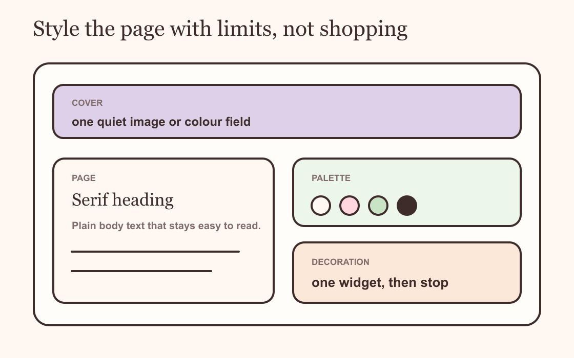
Use one cover and one icon
A page rarely needs a dramatic cover, a busy icon, coloured headings and illustrated dividers together. Choose the detail that sets the mood. Let the rest support it.
If you use a photographic cover, crop it so the quiet part sits behind the page title. A flat colour or simple texture is easier to pair with databases. For icons, repeat one family: all emoji, all simple line icons or all letters. A consistent set looks intentional even when each page has a different subject.
There is no prize for decorating every nested page. Give the home page and major sections the full treatment. Plain working pages can remain plain.
Let spacing do some work
Group related blocks under a short heading, then leave a blank line or divider before the next group. Use columns for a real relationship, such as tasks beside a timer. Do not split text into three narrow columns simply to make the page look designed.
Keep heading levels in order. The page title names the whole page, large headings name sections and smaller headings divide those sections. This makes a long page easier to scan and keeps the visual hierarchy steady.
Callouts work best when they hold something distinct: a weekly intention, an important link or a note you need before starting. Five callouts in five colours become wallpaper.
Add one widget that belongs
A widget can connect the palette and make the dashboard feel personal, but it should earn the space. Choose one that supports the page's job. A focus timer belongs near a study list. A small minimal clock can suit a page left open while you work.
Match the widget background to the surrounding page and repeat the accent once. Keep its type readable in both light and dark mode. The widget customisation guide covers colour, type and sizing without turning every embed into a separate theme.
If the page already works and the widget adds nothing useful, skip it. An empty column does not need rescuing.
Check the real page
Open the page at your usual desktop size and on your phone. Notion stacks columns on smaller screens, so the lovely side panel may become a long detour before the task list. Move the essential block first and shorten labels that wrap awkwardly.
Use the page for several days. Notice what you scroll past and what you keep opening from the sidebar instead. Remove one ignored block before adding another decorative one.
A template can be useful when you need a tested system. It is not a requirement for a beautiful page. If your existing page already holds the right work, a small visual recipe will take it further than a fresh copy with nowhere for your habits to live.