
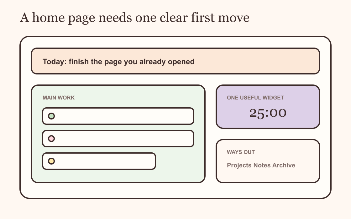
A simple Notion home dashboard needs three things: the work that matters now, links to the pages you use, and enough empty space to see both. Start on a blank page. Add one main work area and a small navigation section. Only add a widget if it answers a question you ask every time you open Notion.
The page can look lovely. It just needs a job first.
Give the page one job
Write one sentence before adding blocks: "I open this page to..." Finish it with an action. See today's work. Start a study session. Check what is due. Find my active projects.
If the answer contains four different jobs, choose the one that brings you back most often. The home page can link to a reading list, finance tracker and archive without displaying all of them.
Name the page something plain enough to recognise in the sidebar. Home works. Today works. A decorative title is fine too, but it should not make you pause and wonder where the useful page went.
Build the main area first
Put the part you came for directly under the title. For most personal dashboards, this is a short task view, an active project list or a linked database view filtered to the next few items.
Keep the first view short. Five visible tasks are easier to enter than a database stretching through the week. The full list can live on its own page. Your dashboard is the doorway, not the storage cupboard.
Add one sentence above the list if the page needs orientation. "Choose the next small move" does more work than a paragraph of instructions you will stop reading.
Add ways out, not more sections
Create a small row or column of links to your working pages. Projects, Notes and Archive are enough for many setups. A student page might use Courses, Assignments and Reading instead.
Links keep the home page light because each subject gets room elsewhere. They also make old pages easier to retire. You can move an inactive project to the archive without rebuilding the dashboard around the gap.
I would keep navigation near the top or at the end of the first screen. A beautiful gallery of twelve destinations is still twelve decisions before the work begins.
Choose one useful widget
The first widget should answer something Notion is not already showing clearly. A focus timer can start a work block. This Week can show the shape of the next few days. A small date or clock can help when the dashboard stays open on a second screen.
Do not add a clock, quote, weather card and three progress bars because the empty column looks lonely. Empty space is doing a job. It separates the next action from the rest of the page.
If you want a second widget, give it a different purpose. A timer beside a weekly view makes sense. Two decorative clocks competing for the same glance do not.
Make it work on a phone
Notion stacks columns on smaller screens. The right-hand widget may drop below the task list, while a narrow navigation column can become a long vertical queue.
Open the page on your phone before adding finishing touches. Put the main work above supporting widgets. Use short link labels. Resize embeds so their controls remain visible without a sideways scroll.
A dashboard that works only on the large screen where you designed it is a desktop poster. A useful home page survives the bus, sofa and five-minute gap before an appointment.
Style the page after it works
Use the page menu to choose a font, text size and width. Notion's current page styling guide covers those controls. Pick one page icon and, if you want one, a quiet cover.
Repeat one accent colour in callouts, database tags or the widget. Do not colour every heading. Consistency comes from repetition and spacing more often than decoration.
Use the dashboard for two or three days before adjusting it again. The part you skip, scroll past or forget to update is telling you more than the finished screenshot did.
The one-screen test
Open the dashboard at your normal window size. Can you see the main work, one route elsewhere and the useful part of the widget without scrolling?
If yes, leave it alone. If no, move reference material to another page before shrinking everything. Small text does not make a complicated dashboard simple.