An aesthetic Notion dashboard should make the page easier to return to. If the cover, columns and widgets look lovely but your next task is buried below three quote blocks, the design is working against you.
I like to start with the moment the page is for. Morning planning needs a different page from studying, reading or moving home. Once the job is clear, the visual choices stop feeling random.
A soft morning dashboard
This page should answer two things: what day is it, and what deserves attention first?
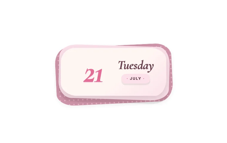
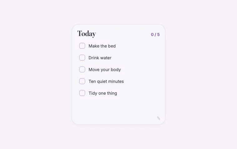
Put a small date card beside a linked view of today's tasks. Under that, add one gentle line, a short daily checklist or a small weather widget if the weather changes your plans. Keep the rest of the week below the fold.
For the look, try warm white, faded pink and one deeper berry accent. A serif heading adds softness, but keep task text in Notion's Default font if you scan it quickly.
Good widget choices:
- Date for the day and month;
- Daily list for repeated morning tasks;
- Daily whisper for one changing line.
The date card and list can share a row. Let the task database stay wider than both. Your work should get more room than the decoration.
A focused student desk
A student dashboard often tries to hold an entire term on one screen. That makes it impressive in a screenshot and tiring in daily use.
Keep current assignments and the next deadline at the top. Put course notes, reading lists and grade records behind clear links or lower down the page. A focus timer belongs near the assignment view because that is where you will start it.
Try a paper-like palette: cream, ink blue and a small red or green accent for deadlines. Course cover images can carry more colour, so the widgets can stay quiet.
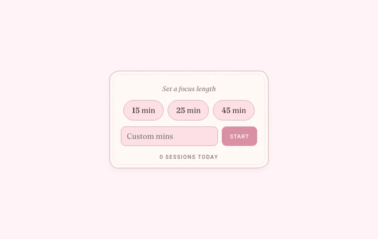
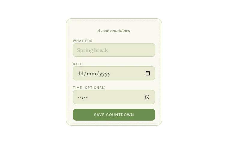
Useful additions include a Focus timer, one Countdown for the next major deadline and a This week view. Avoid separate countdowns for every module. Your assignment database already knows all the dates; the widget is there to keep one of them close.
A reading corner
A reading page can be slower and more decorative because it is not running your day.
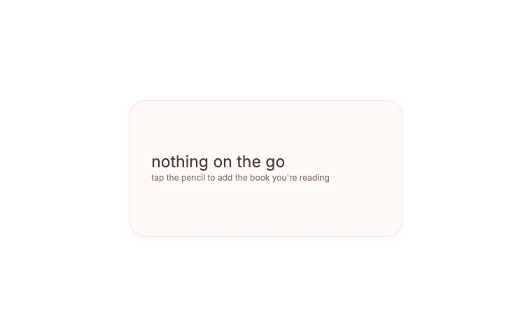
Use a gallery for your reading list, then give the current book a smaller, more intimate section. A cover, a few notes and a page-progress widget are enough. Quotes can sit below the current book rather than rotating above everything else.
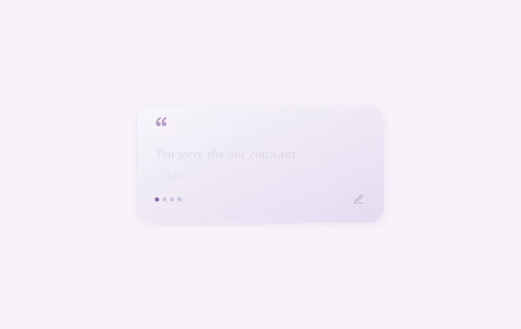
Deep brown, parchment and muted green suit the bookish mood without turning the page into a costume. Notion Serif works well here. A Now reading widget can show the current book and page progress. Moments can rotate favourite lines, but keep quotation text short enough to read at a glance.
A moving-home page
Moving-home pages collect a lot of dull but urgent information: quotes, addresses, box lists, meter readings and dates. A comforting design helps, but clarity matters more than a perfect mood board.
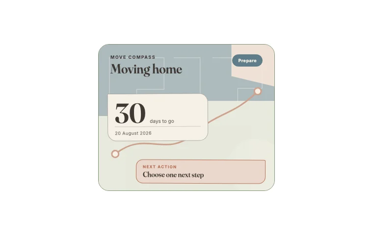
Put the moving date and next action first. Follow with packing status and a short group of moving-day checks. Keep room plans and decorating ideas on separate subpages so paint colours do not compete with the key handover.
A palette of cardboard, soft blue and a small coral accent feels domestic without becoming sugary. Use clear sans-serif type for checklists.
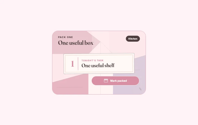
The Move compass, Pack one and Moving day pocket are designed for different stages of the move. Use the one that matches this week's problem instead of displaying the whole set at once.
A dark evening planner
An evening page should feel lower in contrast than the work page you have stared at all day.
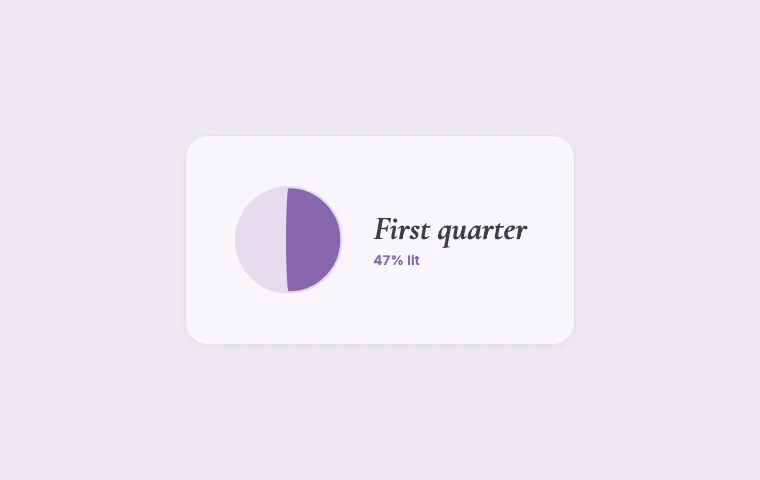
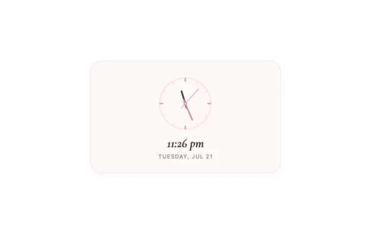
Use Notion dark mode with charcoal widget backgrounds, pale grey text and one muted lavender or amber accent. A moon phase, analogue clock or short reflection prompt can sit above tomorrow's preview. Keep bright white covers off this page; they become a lightbox in dark mode.
The Moon phase, Soft clock and Gratitude jar suit this kind of page. One is enough if your evening routine is short.
How to make any dashboard look more settled
Repeat a few decisions. Use the same background across embeds. Keep one corner style and similar frame heights in each row. Leave empty space around the block you need to notice.
And remove things. If you have not looked at a widget for a fortnight, move it to a holding page. You can always bring it back. A dashboard gets its character from what you choose to keep.