The best student widgets answer a question you already ask: what is due next, how long am I working, and have I done the small thing I keep forgetting?

A widget cannot organise a term for you. Your assignments, course notes and timetable still belong in Notion pages or databases. Widgets are better at keeping a few signals visible while you work.

Start with the next deadline

Countdown Notion widget in its default theme
A plain countdown for the deadline that matters next

Countdown

I would use this for the one deadline that changes how you plan the week. The rest still belongs in your assignments database.

Goal countdown Notion widget in its default theme
The softer note version, less exam hall

Goal countdown

This version suits a gentler dashboard. I would keep the label plain so the date remains the first thing you notice.

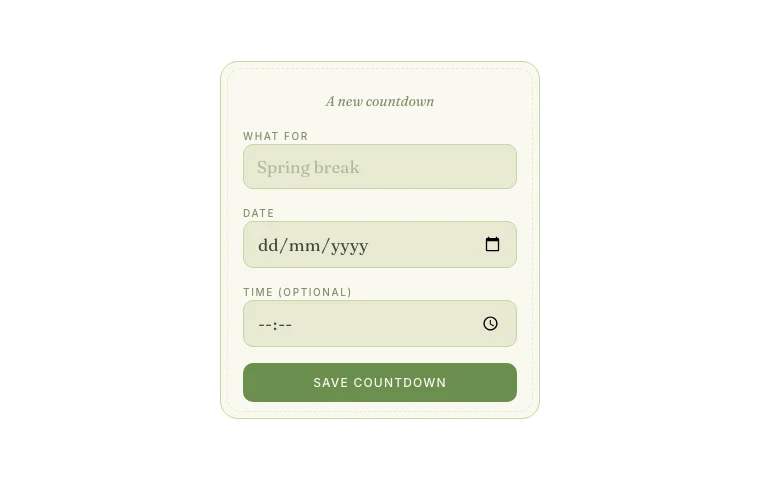
Use one countdown for the next exam, submission or presentation that changes how you plan the week.

The Countdown is the simplest option. Give the date a plain label such as “History essay” or “Biology exam”. If you prefer something softer, Goal countdown puts the date on a note-like card.

I would not create a countdown for every assignment. Put the full list in an assignments database, sorted by due date. The widget should pull your eye towards the one deadline that needs extra weight.

Add a timer where the work begins

Focus timer Notion widget in its customised theme
Focus Timer in blush, where I would keep it

Focus timer

I would put this beside the assignment list, close to the work itself. Fifteen minutes is a perfectly respectable starting point.

Visual timer Notion widget in its customised theme
The shrinking disc is easier to feel than a number

Visual timer

Choose this when a coloured shape makes more sense to you than a row of numbers. It is especially useful at a glance.

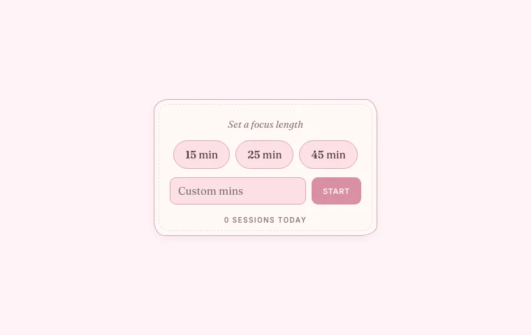
A focus timer is useful only if it is close to the work. Put it beside today's assignments or at the top of a dedicated study page.

The Focus timer uses timed work sessions and automatic breaks. The Visual timer shows the remaining time as a shrinking disc. The second option suits people who understand a coloured shape faster than “17:42”.

Start with a session length you can repeat. Twenty-five minutes is familiar, but there is no prize for forcing it if you settle better at fifteen or forty. The timer is a boundary, not a test of character.

Keep the week visible

This week Notion widget in its customised theme
A week strip with only the bits I need

This week

This is for a week that changes often. Keep each note short; anything with attachments or a long description belongs in Notion.

Week rhythm Notion widget in its default theme
Week Rhythm before changing the colours

Week rhythm

I would use this for the things that repeat: lectures, library days and regular shifts. It gives the week a shape without becoming another calendar.

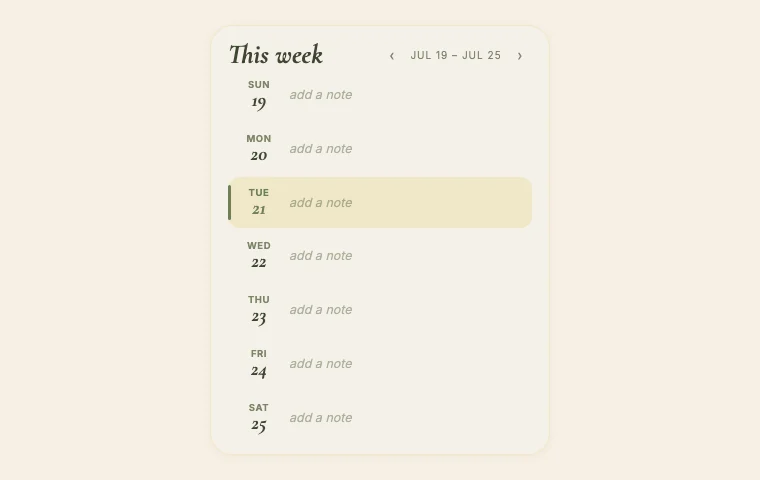
A small weekly view helps when your classes repeat and your assignments do not.

This week shows seven days with room for a short note on each. Week rhythm is better for a repeating timetable: seminar on Monday, library on Wednesday, lab on Friday.

Use a Notion calendar when events need full details, attachments or filters. Use a widget when you only need the shape of the week.

Track one habit that supports studying

Habit streak Notion widget in its customised theme
A small streak, nothing too heroic

Habit streak

Pick one action you can honestly tap without debating it. A streak is much less useful when the label is as vague as “be productive”.

Daily list Notion widget in its customised theme
The daily list after a pink tidy-up

Daily list

This works for a handful of actions that reset each morning. If the list starts looking like a timetable, move it into Notion.

“Be productive” is too vague for a habit tracker. Choose an action you can tap without debating it: review flashcards, pack tomorrow's bag, read for twenty minutes or attend the planned study session.

The Habit streak gives you a row to tap. The Daily list works when you have a few small actions that reset each morning. Keep the list short. If it grows into an entire routine, move it into Notion where you can edit and group it properly.

Streaks can be encouraging until one missed day makes the whole row feel spoiled. If that happens, switch to a monthly total or a colour grid. The record should help you notice patterns, not scold you.

Make room for energy, not just output

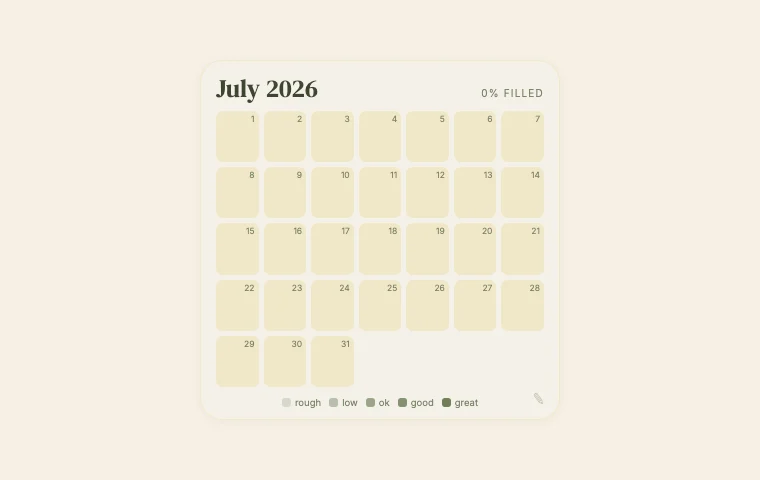
Mood month Notion widget in its default theme
Mood Month as it comes

Mood month

Use one measure and name it. “Energy” will mean more next month than five unexplained shades of pink.

Pixel month Notion widget in its customised theme
The pixel grid when I want the month at a glance

Pixel month

I like this when you want the pattern without a diary entry. Skip it altogether if recording your mood feels like homework.

Students often build dashboards that record every task and nothing about the person doing them.

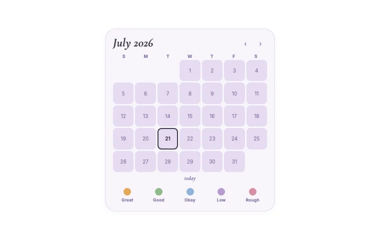
A Mood month or Pixel month can track mood, energy or focus with one colour per day. Pick one measure and name the scale clearly. “Energy” is easier to interpret later than five unexplained shades of pink.

You do not need this section if tracking yourself feels like another assignment. Delete it. A useful dashboard can be only deadlines, notes and a timer.

A student dashboard layout I would use

At the top, place today's date beside the next important deadline. Underneath, give the assignment view most of the width and put the focus timer in a smaller column. Follow with the week, then course links. Habits and mood can live lower down because they support the work rather than decide it.

On mobile, those columns will stack. Put the assignment view before the timer so you see what you are starting before the start button.

Try the page for a week before adding anything else. The first edit is usually removal. If a widget has become wallpaper, it no longer belongs on the main dashboard.