
The clock looked lovely in the preview. So did the calendar. Put them beside a progress tracker, though, and your Notion page looks as if three different people decorated it.
Before replacing everything, find the detail that keeps catching your eye. It may be the background, the size of the lettering or one particularly heavy border.
Find what feels out of place
Look away from the page, then look back. Where does your eye go first? A bright card may be right for an important countdown. A clock you rarely check probably needs less attention.
Compare these details before changing the whole design:
Cool white beside warm cream can make two similar colours feel different.
A thick border or oversized title pulls attention towards one card.
A cramped calendar and a generously padded clock can feel uneven.
Change one of those things, then look again. It is easier to judge a single adjustment than a completely new palette.
Give neighbouring widgets something in common
Try a shared background first, if the settings allow it. Then compare the borders and lettering. You can repeat a colour or shape without making every widget identical.
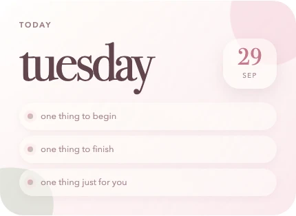
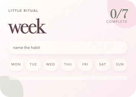
The daily card has large lettering; the habit tracker needs smaller controls. They still look related because the backgrounds, colours and shapes repeat. That is the useful part of a coordinated set.
Keep the detail you like most
If you chose a widget for its illustration or decorative type, keep that detail and simplify something nearby. Small labels should still be easy to read.
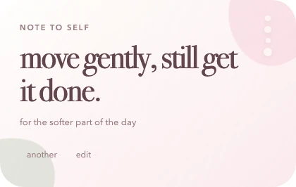
For individual controls, our customisation guide covers colour, type and sizing.
Check the page while you use it
Find the date, read the note and check the task. Try your phone too. If you keep searching for information, make that part clearer before adding more decoration.
Stop when the widgets feel comfortable together and the information is easy to find. You can keep the little differences you enjoy.